Colour enters the project at an earlier stage, shaping how space is perceived and experienced.
Surfaces take on an active role, defining atmosphere, influencing behavior and building identity.
For designers working across interiors and materials, this shift is precise.
Finish defines the project. It sets direction and establishes intent.
Within this landscape, yellow reappears with a different weight.
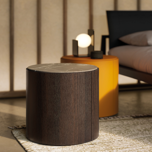
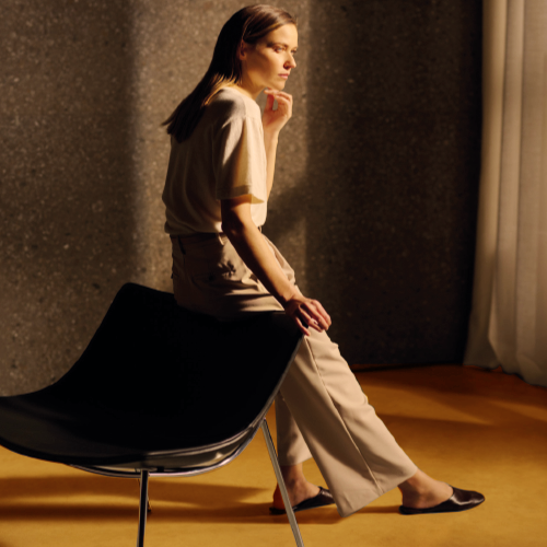
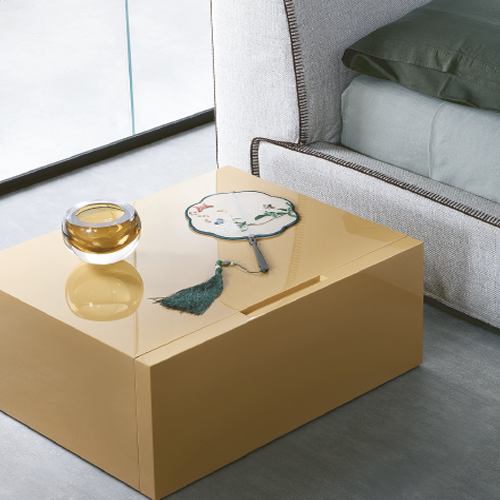
Less immediate, less decorative, it moves into a more refined register. From soft butter tones to deeper amber shades, it introduces warmth and luminosity with a stronger sense of density. Light feels thicker, more physical, less diffused.
Its interaction with darker tones reinforces this shift. Deep browns, almost earthy or chocolate-like, bring weight and stability, grounding the palette and intensifying its sensory dimension. The contrast works through depth and material presence, not surface effect.
In parallel, sustainability takes form through aesthetics.
Wood, stone, glass and metal are explored through matte finishes, irregular textures and layered surfaces that reveal process and imperfection. Materials retain variation, density and tactility, avoiding uniformity.
Interiors move toward a more intimate and grounded condition.
Spaces feel warmer, closer, more connected to everyday use.
Visual references: Lema — Top, Omega, Flin / Kanz Architetti — Isola Topazio